06 / Brand and web
Gautam CPAs
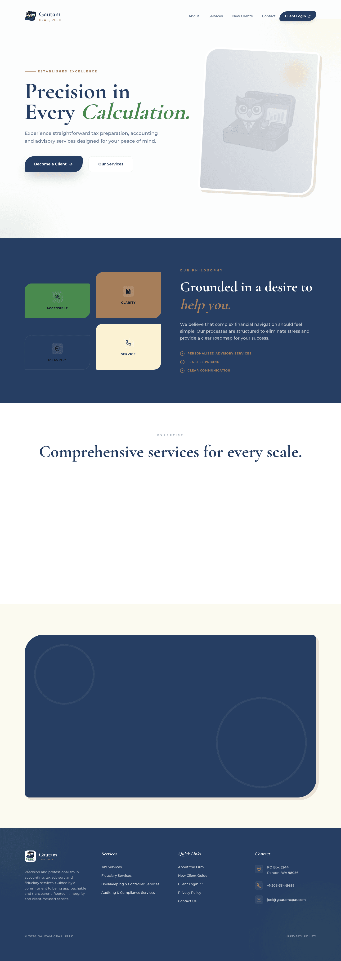
I built Gautam CPAs' website and brand system around its promise of precision without making accounting sound like a punishment.
Context
People looking for accounting help need to know what is offered, what the process feels like, and how to start. Gautam's site had to make that path clear without hiding behind financial jargon.
The problem
The work was translating precision, professionalism, clarity, integrity, and service into a site that feels human enough to contact.
Work involved
I handled the brand direction, website content, frontend implementation, project coordination, and client communication.
Approach
- Built the visual language around navy, cream, green, and warm ochre, with editorial typography and generous space.
- Organized the services into tax, bookkeeping and controller, fiduciary, and new-client paths.
- Made the firm's philosophy and process explicit, with clear calls to become a client or start a conversation.
What this work shows
The work turns a professional-services brief into a usable path: understand the firm, see where you fit, and start without having to decode the website first.
Technical or communication skills involved
Outcome
A site that presents Gautam CPAs as precise and approachable, with its services, philosophy, new-client path, and contact details in one coherent system.